
A dedicated mobile app with responsive
website designed to allow users to register to vote online.
Sole UX Researcher / UX Designer
responsible for user research & testing,
wireframing, and low/high fidelity prototypes
January 2022 - February 2022
Adobe XD, Figma
There are many unregistered voters in the US, and these are many barriers for people to register based on socio-economic status. This was my third project for the Google UX Professional Certificate.
Create a way for people to register to vote easily so long as they have access to the internet.
User research was conducted through the use of general surveys that were given to a variety of unregistered voters of varying ages, ethnicities, gender identities and ability levels. This increased diversity during the testing phase and allowed me to better understand the specific problems that each demographic and sociographic group was facing when trying to register.
After conducting user research it was clear that user pain points revolved around a lack of education on registering and difficulty navigating existing registration sites. These pain points helped me structure initial designs focused around ease of use and education.
After analyzing and synthesizing the results of the user survey I was able to gain 3 main insights.

Users were not aware of election details, or did not know enough about the race
to participate. Most participants were familiar with presidential candidates.

Government websites and other traditional registration sites tend to be complex and discouraging for users. This leads to lower registration.

Saving videos can sometimes be difficult on other sites which can be hard for users who need to return to a project afterinitiallyviewing the video
Creating user personas allowed me to imagine how different types of users would navigate the app. It was especially important for me to think about the situation in which the users would be using the app since location and context would greatly change the needs that users would have. For example, a user would be looking for a much different experience if they were actively working on a project and needed the videos for reverence versus if they were looking for new inspiration while sitting at home.


Since this is not the first registration site it was important to look at existing options to understand what problems users still faced when trying to register. By looking at existing options I was able to determine what works well for them and what can be improved on. This was crucial to the design process so I could avoid some of the pitfalls of these sites while replicating their successes.


Some of the main takeaways from the competitive audit were that the current non-governmental options allowed voters to register on the site or offered voter education, but did not do both. Government organizations like USA.gov offered both education and registration, but presented it in a format that overwhelmed voters and was confusing to most survey participants. 3 out of 5 survey participants claimed that the mobile versions of government sites (USA.gov and Vote.org) are hard to use, and discouraged them from completing the process.
With this in mind, the initial wireframes created revolved around ease of use and creating an intuitive experience for users. Additionally, providing a mobile experience for users would help differentiate the product from other existing sites.
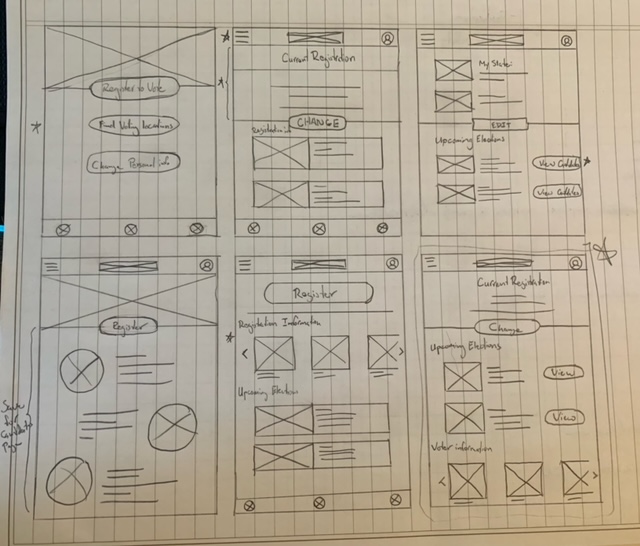
After user research and my competetive audit I began creating wireframes and ideating on page layouts anduser flows. Performing these tasks on paper allowed meto ideate quickly and make changes to designs easily.
Based on the results of user testing and ideation exercises I came up with the following design solutions to the user’s pain points:
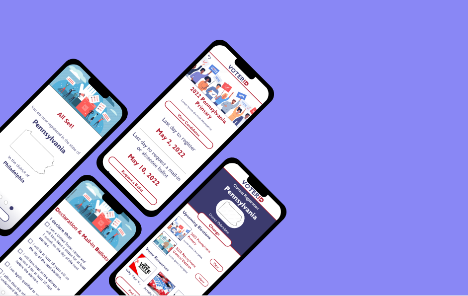
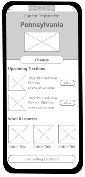
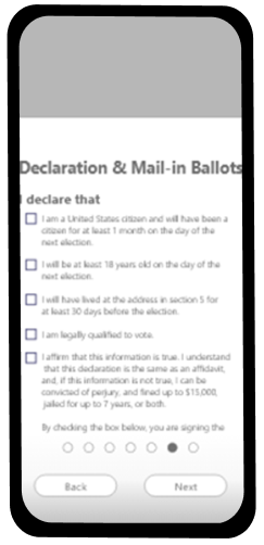
Click here to view my wireframes - the functioning user flow is for someone registering as an independent Asian voter from Philadelphia, Pennsylvania. All other button options have not been programmed.
After turning the digital wireframes into a low-fidelity prototype by connecting the screens I conducted a usability study where participants were asked to complete a series of tasks and explain their thought process while navigating the site. This test helped me identify user pain points within the design and refine the prototypes to better suit the user’s needs.

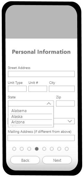
Dropdown menus were too small on mobile - users struggled to select the correct option.

Users wanted confirmations after actions were completed to indicate success.

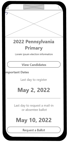
Users wanted more functionality within the app after registration was complete - more educational material / election information.
After conducting usability studies with my designs, I took user feedback into consideration and refined my original designs. The changes made after usability studies helped streamline the user flow and add in additional features that would make the app more helpful to users. A few of the main changes that I made after testing were as follows:
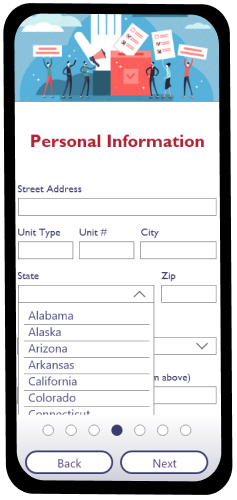
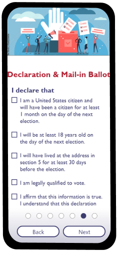
Click here to see my high fidelity prototype for mobile platforms
Taking a user centered approach to design is critical for building something that people will actually use. During this project the research that I did before ideating helped a great deal with creating designs that solved user problems. As with most things, it is much more productive totake the time at the beginning to understand the user and figure out
which direction to go than to change course midway through the process.
AS someone who loves to sketch and design sometimes I feel like I need to create all of the visual elements of my designs myself in order to make them truly unique. Although creating my own visual elements seems like the best way to create something interesting and visually appealing, I often and end up spending much more time making clipart and graphics than actually working to make the app more helpful for users. Discovering tools like Adobe Stock and Unsplash during this project helped me save loads of time while making mockups and focus on the user experience a bit more without compromising on the visual appeal.
Reach out about opportunities or just to say hi!


